CDC vs. WHO vs. IAP Growth Charts: What's the Difference?
WHO growth charts describe how healthy, breastfed children should grow, based on an international reference study. CDC growth charts describe how a large sample of American children actually grew, mixing breastfed and formula-fed infants. IAP growth charts adapt the WHO standard using Indian children's growth data. Indian pediatric clinics generally use IAP charts so children are compared against a closer, more representative reference population.
Three names, three reference populations, and one question that actually matters clinically: which population is a given child being compared against, and does that comparison make sense for them?
Three standards, three purposes
All three chart systems plot the same basic measurements — weight, height/length, head circumference, BMI — against age. What differs is the reference population each one is built from, and that difference is the whole reason three standards exist instead of one.
| Standard | Reference population | Typical use |
|---|---|---|
| WHO | International, multi-country study of healthy, predominantly breastfed children raised in favorable conditions | Prescriptive — how children should grow. Widely used birth to age 5. |
| CDC | Large US national sample, mixed breastfed and formula-fed | Descriptive — how a reference population actually grew. Common in the US from age 2 onward. |
| IAP | WHO standard adapted with growth data from Indian children | Used across India by most pediatric clinics, birth through adolescence. |
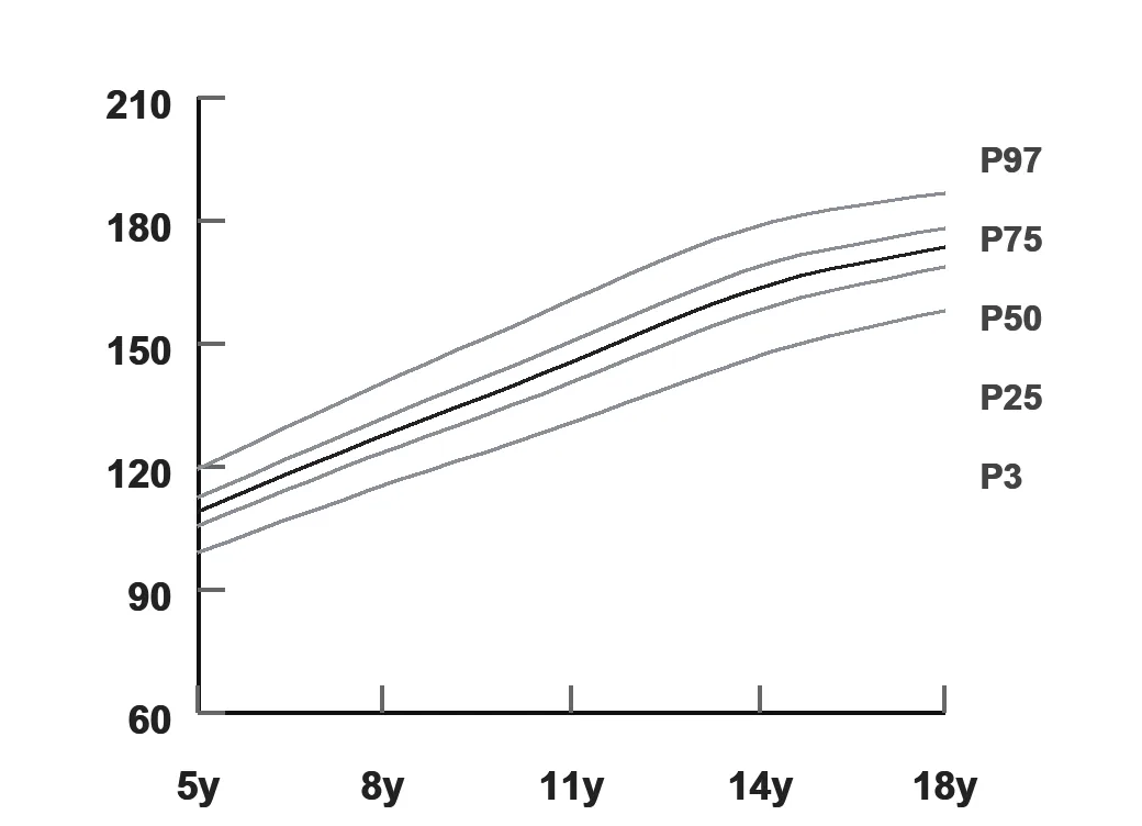
Why the same child can land on a different percentile
Because each chart is built from a different reference population, the same measurement — say, a 14-month-old's weight — can land at a different percentile depending on which chart it's plotted against. This isn't a measurement error and it isn't a sign anything changed about the child; it's a reflection of which group of children the chart is comparing them to. This is exactly why mixing standards for the same child over time is misleading — a percentile "jump" caused by switching charts looks like a growth problem when it's actually just a change in the ruler being used.
Same child, different reference curve
Conceptual illustration — how identical growth data can sit differently against two reference median curves.
See the full breakdown of WHO vs. IAP charts and which applies at which age.
Read the WHO vs. IAP guideWhat this means for a clinic's records
The operational takeaway is less about picking the "right" chart and more about consistency and clarity in the record: every child should be tracked on the same standard visit after visit, and that standard should be clearly labeled so no one — doctor, staff, or parent looking at a printed report — mistakes one chart's percentile for another's. A digital growth chart that locks in the chosen standard per child, rather than leaving it to whoever's plotting the point that day, removes this entire category of error.
Frequently asked questions
What is the difference between CDC and WHO growth charts?
WHO growth charts are based on an international study of healthy, breastfed children raised in optimal conditions, and describe how children should grow. CDC growth charts are based on a large sample of American children as they actually grew, including both breastfed and formula-fed infants, and describe how children in that reference population did grow. WHO is generally used for children under 2, and CDC is more commonly used from age 2 onward in the US.
Why does India use IAP growth charts instead of WHO or CDC?
The IAP growth charts adapt WHO standards using growth data from Indian children, since body proportions and growth patterns can differ across populations. Indian pediatricians generally use IAP charts so a child is compared against a reference closer to their own population rather than an international or US-specific one.
Can a child be plotted on more than one growth chart standard?
Clinically, a child should be tracked consistently on one chart standard over time, since switching standards can make a percentile jump look like a growth problem when it's actually just a difference between reference populations. Comparing charts side by side is useful for understanding, not for switching a child's ongoing tracking back and forth.
Does the choice of growth chart change a doctor's clinical decision?
It can affect where a specific measurement falls on a percentile curve, which is why consistency matters more than which standard is chosen. A trend over time on one consistent chart is more clinically meaningful than a single percentile number compared across different standards.
See automatic, consistently-labeled growth chart plotting.
Twenty minutes, real workflow, no script.
Book a walkthrough or chat with us on WhatsApp →